I'm really excited to share with you my next DIY project for my daughter's NYC themed room. As I mentioned in a previous post Jaden (my teen daughter) loves her ballet and plays some piano. On the wall that the piano sits I decided to make that wall a Broadway wall. I have seen many canvas photos around the web and was anxious to try one. Unfortunately most of them involved using a laser copied photo and all I have is and ink jet printer which most of us have. Plus it involved taking what seemed like a million steps and I don't have time for that.
I wanted something simple that only took minutes and to achieve that canvas photo. I seen on some sites where people used tissue paper and modge podge. Of coarse I always have both of those lying around and it was only 2 steps...print the photo onto the tissue paper and glue the tissue paper onto the canvas. SIMPLE!!! I was excited to try this but at the same time a little hesitant. For one it was tissue paper. Print onto tissue paper...I don't know about that, but I was willing to give it a shot. The other...it seemed too good to be true. We are talking about two easy steps to achieve beautiful canvas pictures.
Well let me be the first to tell you that it was so easy and they turned out beautiful!!! At first I was a little intimated working with tissue paper because it is so fragile but it was easier than I thought. So let's get started!
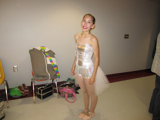
Awhile back I came across some canvas that was on sale. I couldn't pass up the deal and bought them. I had 3 of them just hanging out and thought it was time to put them to use. Jaden my daughter had some photos from her ballet recital that I just loved. Each had horrible backgrounds so I made some background changes using Gimp 2. That's usually the site I use to make changes to pictures. I then did some investigating and used Pixlr to add some touches to the pictures. I absolutely loved it. It was fast and so easy to use. In the past I used other sites but they were more difficult to understand and took forever to download and so forth. So here are the before and after shots of the pictures.
This is my favorite picture.....the 'elegant' look
There's always got to be a crazy pose when taking pictures of teenagers...I wanted to highlight the red lipstick with a red background (that's one thing they stress in recitals...red lipstick)
The 'Broadway' look......the whole costume on stage
I thought I did a pretty good transformation for someone who don't know much about giving pictures a whole other look.
Now the fun part!
I got card stock paper...I wanted the tissue to have a sturdy foundation since it would be going through the printer. I didn't want it to jam or tear. I left some room on the tissue paper so I could tape it down in the back.
I then printed out the photos onto the tissue paper.
This is what it looks like with the card stock underneath it.
This is what the photo looks like on the tissue paper when you take it off the card stock.
Don't worry how it looks because it will change once you put it onto the canvas with modge podge.
Make sure you leave that extra tissue paper around the edges...you will need it when gluing.
Next you will want to put a very thin later of modge podge onto the canvas. It needs to be a very thin layer because if the tissue paper gets too wet, it will rip. I learned this for myself...learn from my mistakes.
Now after playing around and messing up I finally figured out that the best way to put the tissue paper onto the canvas was putting a little modge podge on the side of the canvas and gluing down the extra tissue paper on the side. It holds the tissue paper down so you can lay down the tissue.
The reason for this is.....I first tried laying the tissue paper straight onto the canvas but it wasn't straight and it had to be just perfect without getting bubbles, which was way too hard.
By gluing down that side first it hold down the tissue paper and you can line it up. You can then tug at it slightly and lay it carefully onto the canvas. I'm not sure you can really see it in these pictures so maybe my explanation will help even though I give poor instructions. Thankfully I'm not a teacher.
Next you will want to get out any bubbles. Usually when trying to get bubbles out I like to use a credit card to smooth out the bubbles. DO NOT do this...it will tear the tissue....lesson learned by me. Instead with your finger lightly press on the canvas. I was so surprised how well the bubbles disappeared.
Next cut as close to the picture as possible. It's o.k. if you don't get all the white off because you can glue them down on the side and because the tissue is white and thin it blends right into the canvas.
I did have some creases (as you can tell in the pictures), but I actually liked the look so it didn't bug me. It gave it a 'vintage' look.
I also have what appears to be 'scratches' when looking at the pictures. That is from printing the dark picture onto the white tissue paper. Because the ink was dark it took a lot more ink which caused the tissue to become wet and bunch a little when printing.
When I was done it was kind of wrinkled but the next day I was surprised to see that when it dried the surface smoothed out for the most part.
Getting the picture to line up with the canvas was almost impossible for me so I didn't mess with it much. So as you can see in my photos they are not straight.
Because of the way I needed to print the photos to make sure all of the design fit on the canvas I had to have some white showing.
I have to put hanging the pictures up on hold...I have some other decor I am waiting on. So here's a taste of what they will look like when they are on the wall above the piano.
Now I have some pretty canvas photos for that pretty daughter of mine! I'm actually a little jealous...I want them hanging on my wall!
TIPS:
#1 Put on a very thin layer of modge podge on the canvas.
#2 When laying the tissue paper down go from one side to the other (that's the reason for gluing one side of the extra tissue paper to the side), not top to bottom or vise versa.
#3 Do not use anything to smooth out the bubbles, use your figure and slightly press the bubbles down.
#4 There are some imperfections but after it dries it looks a lot better and it leaves that canvas look.
#5 Canvas is very forgiving...if you mess up, go right to the sink and wash off the tissue paper and start again. It comes off easy and canvas dries fast so you don't have a long wait.
#6 Light colors work best when printing onto tissue paper. The darker colors smears when printing onto the tissue. I actually had to make some changes on the black and white picture and make the background a little lighter than what I had planned...and even then it smeared some, but it still worked for this project.
#7 The lighter colors blend better with the white tissue....so when I used the darker colors it left visible creases of white where the black was...again it didn't bother me too much due to the fact it gave it that 'wear and tear' look.
#8 I printed this onto a 8x10 canvas...I personally wouldn't go bigger that that.
#9 DO NOT modge podge over the canvas, it will tear the tissue paper.
#10 When all said and done if I didn't have to go through the trial and error part it was actually a very simple project. It didn't take much time at all. The last canvas was the only one I didn't have to do a redo on and it only took minutes to complete. I said to myself "If only I didn't have those mistakes this would have been one of the easiest projects I have tackled in a long time". I will be doing this again! Most of all enjoy your photos!


